

THERE IS A POINT
WHAT KEEP US UP AT NIGHT
Be it last month or years ago, there have been career defining moments when a great value was delivered. The most important question I ask my customers is, what keeps them up at night thinking, "Boy, if my customers knew x and y about my business, the phone would be ringing off the hook." Then I create a campaign from those answers. Today I asked myself that question and here is that campaign. These are all very important stories to me. They illustrate specifically how Schonberg Design can deliver a return on investment, way past just cool graphics.
Empower
Growth
FULL PACKAGE
SR Global Security was the first time Schonberg Design branded an entire company. Anything customer facing; this included the logo, brand identity, print collateral, website, social media presence, video animations, lots of very creative writing, and even local SEO. Schonberg Design even got them placement at the top of Google Maps for Ventura, CA. At the start if the relationship they had 6 clients and 20 employees and at some point had as much as 20 clients with 70 employees. They even started business at a second office in Northern California.


MARKETING STRATEGIES
Gary Berman and his business Cyberhero Network isn’t the first time I helped someone with a business plan. But it is the latest. For years, Gary was a philanthropist to the cybersecurity industry after losing a great deal of money from cyber theft. Gary was known to MC at trade shows and had built very strong relationships with the kind of people the NSA calls for help. The only problem was that it was not profitable. Schonberg Design developed a successful strategy for Gary to leverage his relationships without damaging them that is still in use today.
EDGY HUMOR IN MEDICAL DEVICE
I have always had a great sense of humor and am repeatedly told I should be a comedian. But I have always been after a more sophisticated use for my edgy humor, to use it in the otherwise somber world of medical devices. For this product, "The Finger Cut Kit," well I couldn't resist. The other big win is that in advertising, it's best to have as short headline as possible, ideally two to five words. "Just Do It" from Nike and "Think Different" by Apple are two timeless examples. Here, I did the same but with only three letters. They also say images communicate thousands of times faster than words, which is what I have based my entire career on. Here, the image takes over and tells the remainder of the story.


DID SOMEBODY SAY DISRUPTIVE?
When I made my pitch to Green Monarch, I told them they were in what I call a sleeping industry. No-one is doing anything creative. What industry was like this until a talking duck came along, then a caveman and gecko, until now, the insurance industry is one of the most creative advertising industries there are. Now, I'm not saying we need a talking animal but I am saying you should be a lot bolder and clearer. I had them pull out their own and their competitions’ collateral to prove my point and it was not much more then a letter on stationary that looked more like a warning from a bank. He basically said, kid you made your point and flash forward some years, Green Monarch may be my best client of all time. I am not going to say they don't call me a genius at least once a month.
MEDICAL DEVICE ANIMATION
During the height of the 2008 recession, I saved 60% of marketing budget by insourcing surgical animations in time for rapid product launch. The project received a standing ovation from the executive team as well as a promotion for myself. In fact, they gave me the project for marketing purposes and by the time I finished it, it literally became the training tool for the surgeons. It is kind of slow, but keep in mind it is surgical instruction. If your product could benefit from a technical visual explanation, it will be worth a watch.
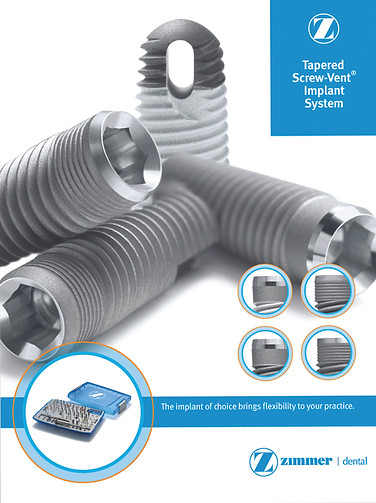
PHOTOGRAPHY ART DIRECTION
Ever since I took commercial art in high school, I have wanted to be an art director. Unfortunately I never donned the title, but during my time at Zimmer Dental, I did get the opportunity to really art direct...a big deal photoshoot involving several product managers and the photographer. I began by cutting down the shot list, to the delight of product managers. I did this by configuring product in a manner that shows all the parts of the product that are new and beneficial. This way, we had the shots we needed but more importantly, we were able to spend more time with the photographer, adjusting the lighting and setup for a premium finished product. The new product was the TSVT, a series of three iterations off of our flagship, industry-leading and often-cloned TSV implant. These new adaptations lie in the collar, the top part above the threads, and were designed for better healing in different type of patients (soft bone, dense bone etc.). Sitting down with the product manager and reviewing the the shot list, of which there were 30 planned, I explained how we will never use most of these. Being the in-house graphic designer at the time for several years, I knew, for example, any straight-on shot, we had always used illustrations and for beauty shots, we usually wound up using one or two maybe. In my opinion, we only needed about eight shots. Politely, the product managers asked me, why, as we have the photographer for the whole day. In proper macro photography, there is a process called focus stacking which requires several shots pieced together. At this level, one does not leave this to post but it must be done live with a tethered computer. So for a group shot of four implants, that is about an hour, done right. Now in agreement, we got the shot list down to about 10. The corporate template had a rectangle in the upper right that often created a limit for enlarging product shots within that space. I knew to stay away from the upper right in order make the three new collars as large as possible, maximizing the product benefit within it's given space. Not needing to show the top of the existing TSV since brand recognition was strong, that was the one we could show the bottom of. Conversely we did not need to show the bottom of the other three. So I literally took out a pencil and planned the composition accordingly. During that design process I had the idea we should show the four collars in a clear comparative manner, so I placed four circles to do just that. Initially we were told this goes against the global standards template design. It was just supposed to be the product large and the kit it goes into smaller at the bottom. I reminded them, we are corporate, we paid for the templates, so we can make the call if we like. The product managers kicked this upstairs and C-level agreed. On the day of the shoot, at the photographer's studio in a big tech district in San Diego, we arrive to the setup being ready for us. An extremely expensive, full format camera tethered up with a myriad of lighting tools at our disposal. It was my job to actually handle the implants with gloves and rubber tweezers and set them up for the shot. We could all see on the monitor what was happening in the viewfinder. It was easier for me to make my configuration not having to bend over a viewfinder. Additionally I held up my pencil drawing next to the monitor to further confirm it was correct. Then lighting was dialed in and we began the meticulous focus stacking process, required to get any object entirely in focus during macro photography. During the day, keeping a close eye that no one would touch the implants without gloves was also very important. At this extreme resolution, oil on hands will appear and can ruin the shot or at least make the retoucher's job extremely difficult. After post, the final retouched photos came across my desk. Fitting into the template just as planned, the product was a key part in a very successful new product launch, becoming a popular version of the TSV; estimated as much as 30% of the sales being the TSVT after product launch.
CYLANCE ADVANCED PRODUCTION GUIDE
During my freelance time with Cylance, I created a significant set of bulletproof international templates with a detailed advanced production guide for incoming Cylance graphic designers to adhere to when rolling out an approved domestic print piece to international distributors. Each language has is own rules for punctuation and spacing. For one reason or another these can get missed. I have had so much experience with Zimmer pasting in translated text that I was familiar with most. For example in French there is a space before colons and so if that gets missed somehow, I set up what is called a GREP style sheet automation, something most people don't know InDesign can do. So if anyone were to paste French text with no space before the colon into this document, a space would automatically be added. One can also set that up to make the company name auto-format to be bold italic, in color and with a superscript ® so designers don't waste time doing that all day. On to the Chinese, Japanese and Korean...now this got even more advanced and even a bit controversial. As I was setting them up, I realized all of the materials they have been sending out to Asia for the past year or two were wrong. The space between the letters and sentences for example. I thought I would be the hero when I told them it was fixed. They seemed offended, more so defensive asking me if I was right, how come none of the Asian managers pointed it out. This was one of those realizations that it was time to start my own business where doing a good job doesn't get you in trouble and there is no lane for me to stay in. I also told them about an XML plugin that can reduce production staff by two or three heads, which outraged the room even more. This process is fairly simple as one exports the text from the domestically approved piece to an XML file. A professional translation house will be able to take that and provide back the translated file in XML. Then a designer opens InDesign and replaces the XML file and the text is instantly formatted just as exported, no matter how long the document is. To do this, one must be aware that other languages run a third longer on average than English, so the template you start with needs to have that room at the bottom of every text box when the translated text is imported. Add to all of this, these were required to be fully justified and two column, with room for an image to the right. If you know typesetting, this is as hard as it gets. Add to that I had to make sure the long-worded German language would look just as good. In fact, I had to start with the German language for the templates for that reason. Once I got the German one looking great, the rest were easier.
